Case study · Product Design
Improving Candidate Experience in a Predictive Assessment Platform
Improving candidate experience while increasing completion rates and perceived fairness.
A redesign of the candidate-facing testing interface at BlueOptima, focused on reducing friction, improving usability and driving measurable improvements in completion and perception.
Project snapshot
At a glance
Impact at a glance
Context
The problem
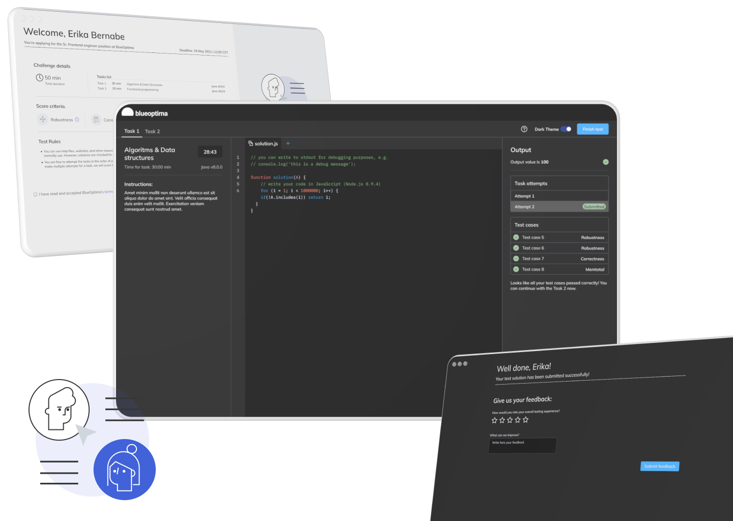
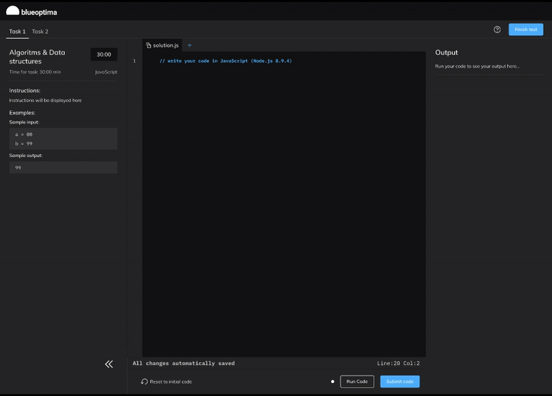
BlueOptima’s Predictive Assessment helps teams evaluate engineering talent. The existing testing interface created friction for candidates, impacting completion and trust in the process.
- High drop-off at critical steps (instructions / transitions / submission).
- Unclear system feedback created uncertainty and perceived unfairness.
- Inconsistent UI patterns increased cognitive load and slowed progress.

Research
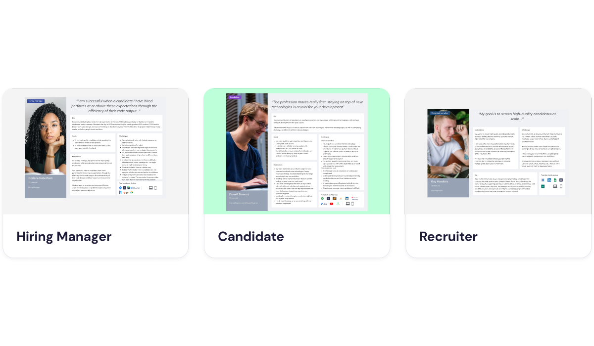
Understanding users and constraints
I combined qualitative feedback with funnel insights to understand where candidates struggled, why they dropped off, and what influenced perceptions of fairness.
- User interviews
- Usability testing
- Journey mapping
- Analytics review
- Uncertainty drives abandonment.
- Progress visibility increases trust.
- Consistency reduces cognitive load.
Mapping
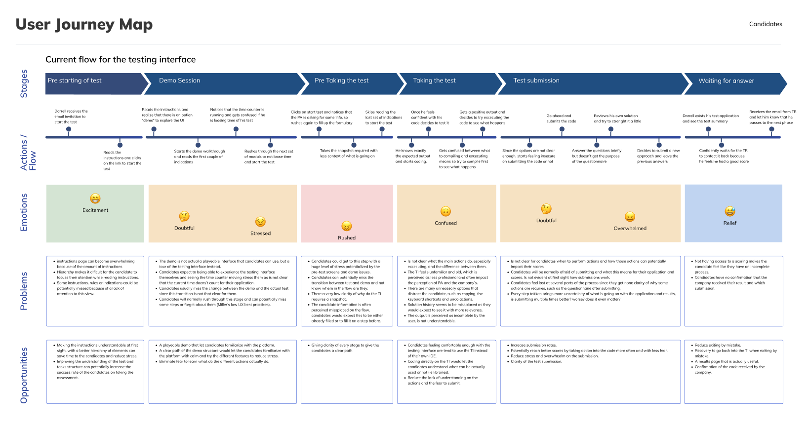
Journey & friction points
A simplified journey map helped align stakeholders around the biggest drop-off moments and the emotions behind them, prioritizing changes with the highest impact on completion and perception.
Product thinking
Hypotheses & success metrics
Design
Exploration, decisions, iteration
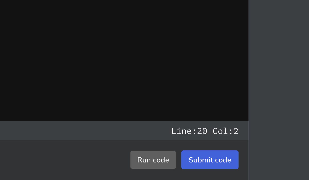
I explored multiple interaction patterns to reduce friction and make progress, rules and outcomes clearer. Key decisions were validated through usability testing and A/B experiments.
Key decision example
Simplifying candidate actions from multiple buttons to a clearer primary action improved confidence and reduced hesitation.
- Reduced ambiguous actions at critical steps.
- Improved visibility of “what happens next”.
- Added system feedback and confirmations.

Outcomes
Validation & results
We validated the redesign through usability testing and A/B experimentation, tracking key funnel and perception metrics.
Collaboration & handoff
I worked closely with engineering throughout the process to ensure feasibility, define states, and deliver dev-ready specs.
- Shared interactive prototypes and annotations.
- Defined states, edge cases and success criteria.
- Iterated post-launch based on feedback and data.
Key learnings
- Clarity at transitions prevents most drop-offs.
- Perceived fairness improves with transparent rules and feedback.
- Small UI decisions can drive measurable funnel impact.
Next
Snuze App — Hotel reviews & rewards
Contact
[email protected]
Based in Paris, France 🇫🇷
Open to work worldwide.
© 2025 Pedro Mugartegui · Portfolio hand-coded with love ❤️


